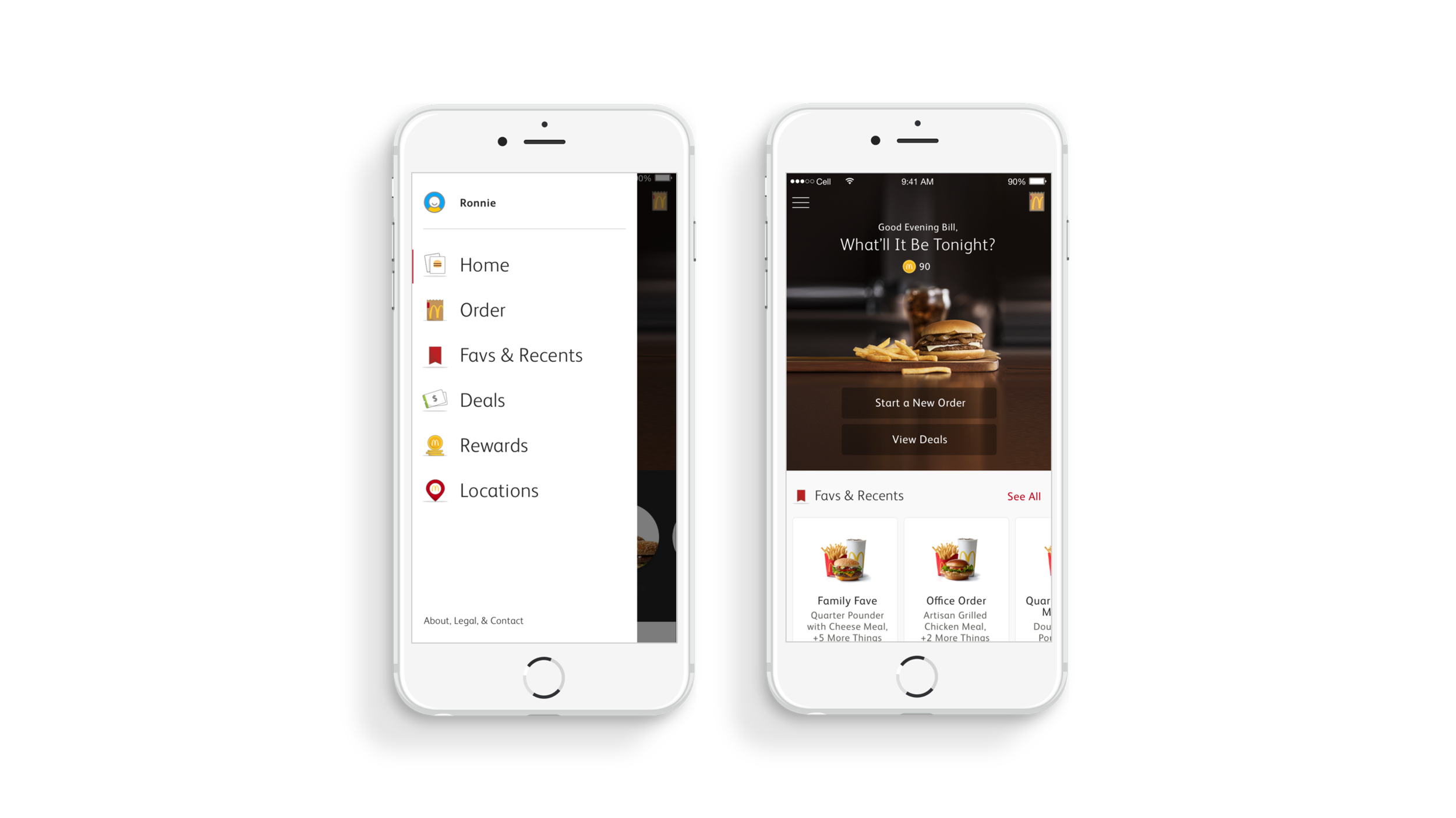
Ushering in the world's largest restaurant to our digital present is no small task. In March, 2014, Method was hired to bring the brand to their customers. So our work began with reaching them wherever they happened to be: a global mobile app. Designed on McDonald's brand principles, the app lays the foundation for their future ambitions: ordering, customization, delivery, and beyond. From there, work started on designing interfaces for the global kiosk rollout. We were then tasked with reimagining the corporate website. Every initiative stemmed from our global digital design system: rules and guidelines covering all aspects of UX, visual design, and language.
As lead writer, my role was to develop and apply a brand voice rooted in McDonald's heritage for the global digital platform, flexing in tone for each touchpoint. With each sprint, I worked closely with UX, visual, and creative design technologists on the global mobile app, kiosks, and web properties. Context, clarity, and consistency were the constant benchmarks in the almost four-year engagement, with millions of customers now interacting with McDonald’s on their terms.
creative direction, branding, writing


